About
"Tangerine" is a self-care/goals app featuring a mood tracker, habit tracker, and a journaling component to help improve your mindset and achieve your goals.
Project Goal
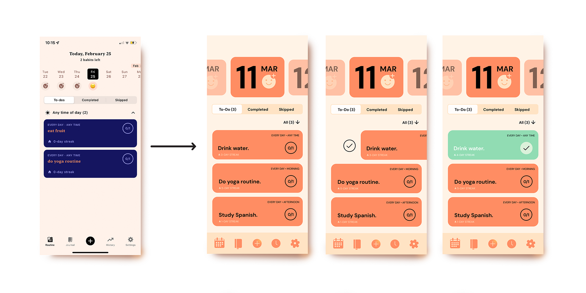
I decided to redesign this app to improve the original design's tone correlation and consistency in the app's UI. My main objective was to simplify the interface and to refine the layout of information to make it less cluttered and more accessible.
Design Solution
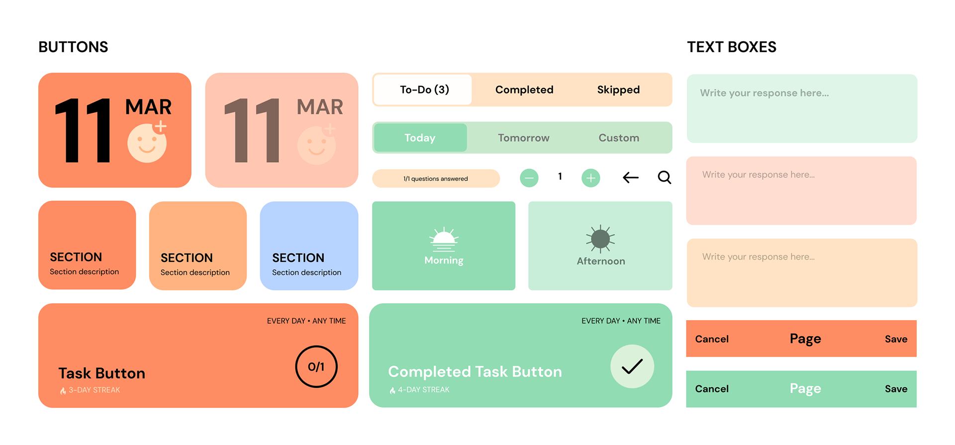
To give the app a more cohesive look, I simplified the colour palette and created custom buttons, icons, and emojis. I unified the formatting and layout between each screen, and increased the size of the buttons and text to improve readability.

Colours
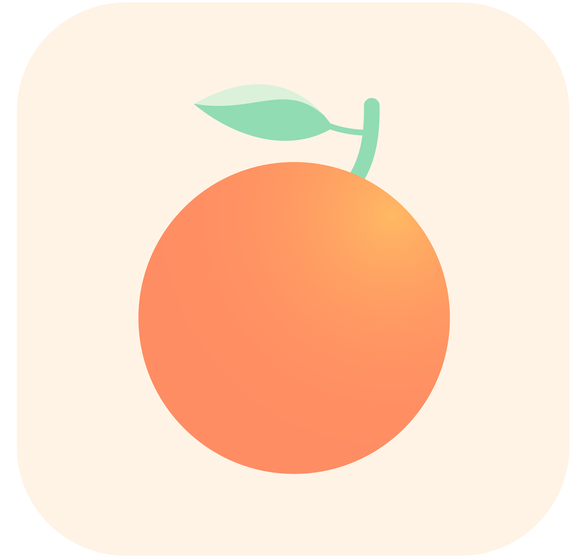
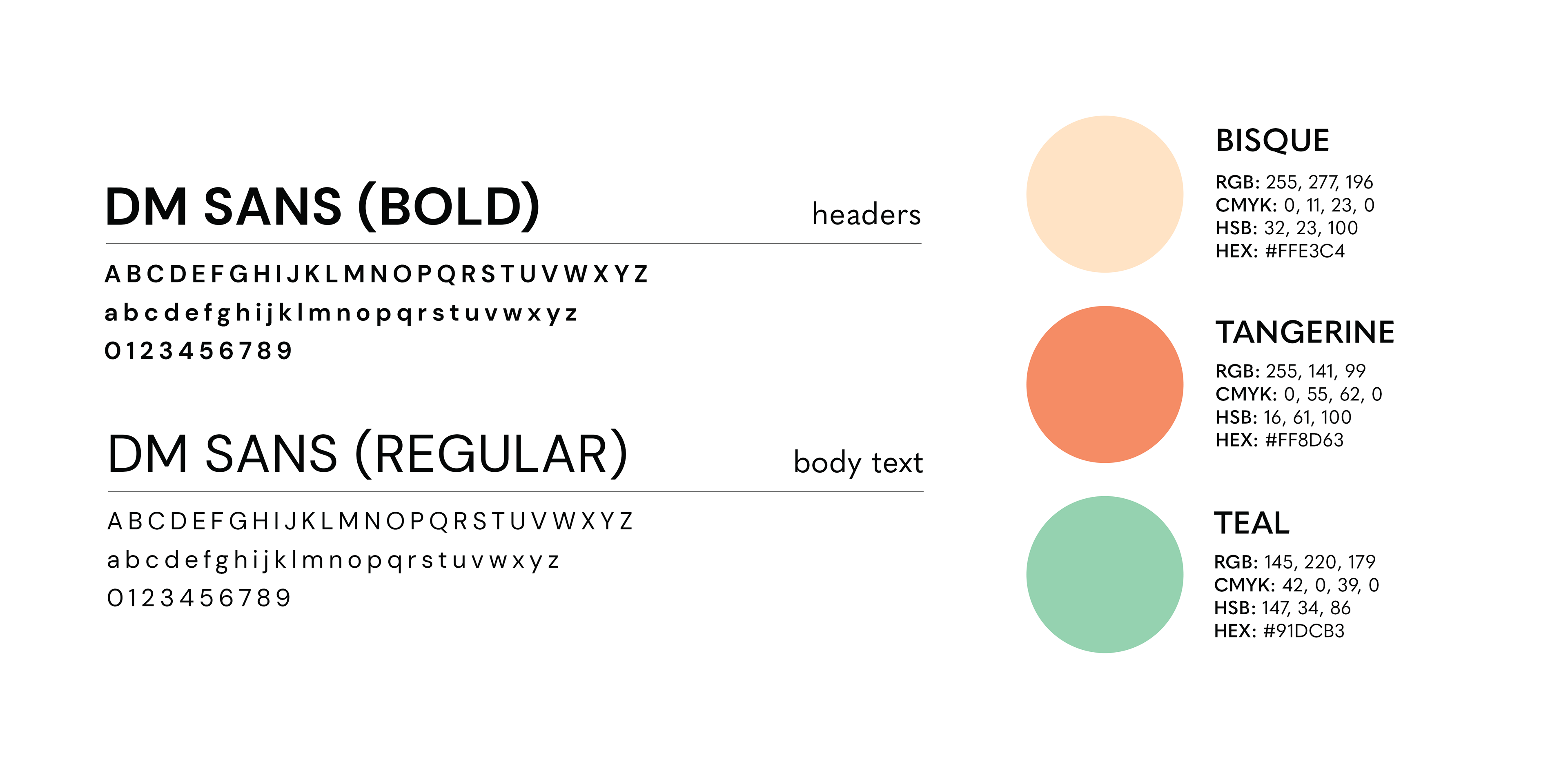
I kept the app's original tangerine colour but decided to amplify its usage (in the original app it was only used as an accent colour). I added a teal green for complementary contrast. The two colours are used in the logo and together are more in line with the "tangerine" theme. I then added the bisque colour for background/accents which keeps the palette on the warmer side.
Typography
I used the typeface "DM Sans" to give the app a clean, modern, and inviting look. I wanted to use a sans serif font because it was more legible than the serif font selected for the original app. DM Sans has many font weights which made it a versatile choice.
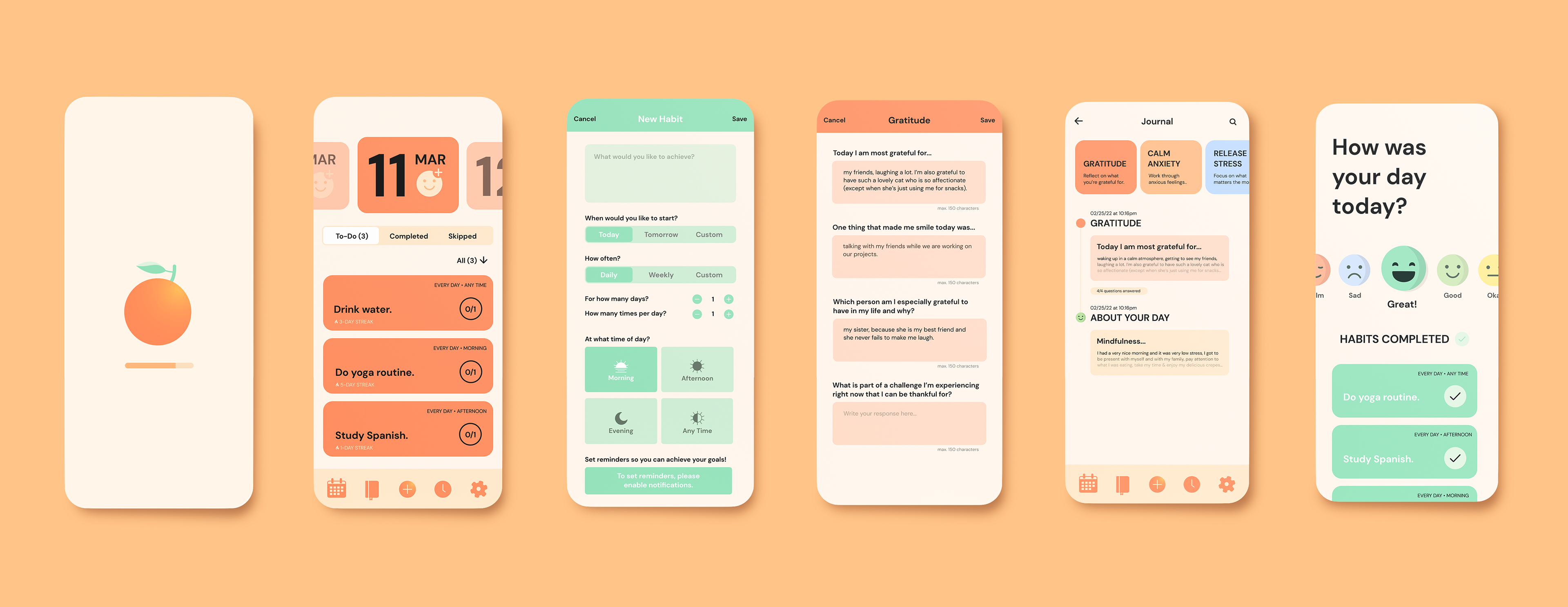
Screens (Before & After)
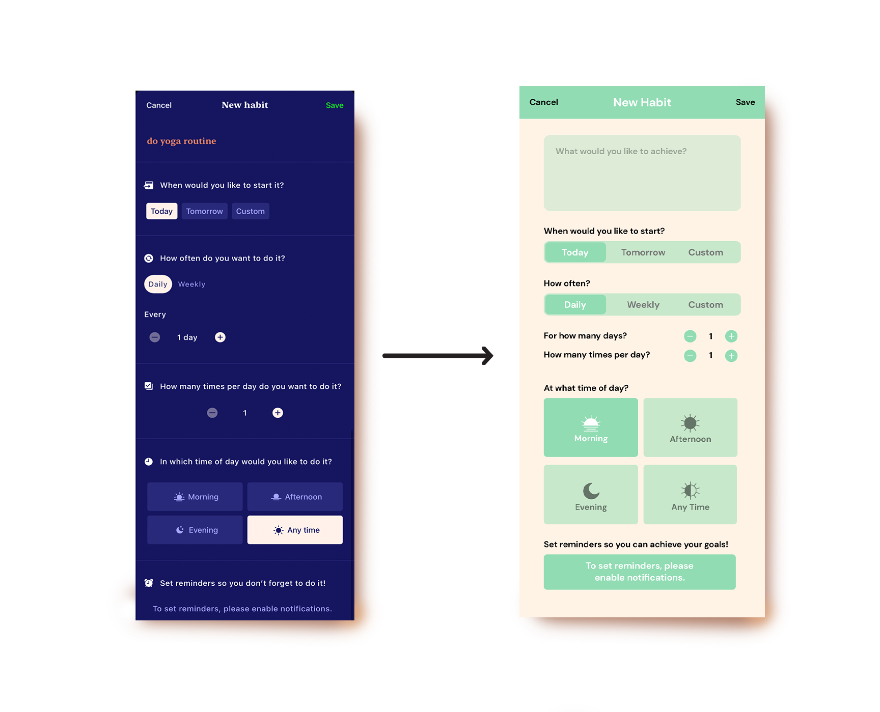
NEW HABIT PAGE
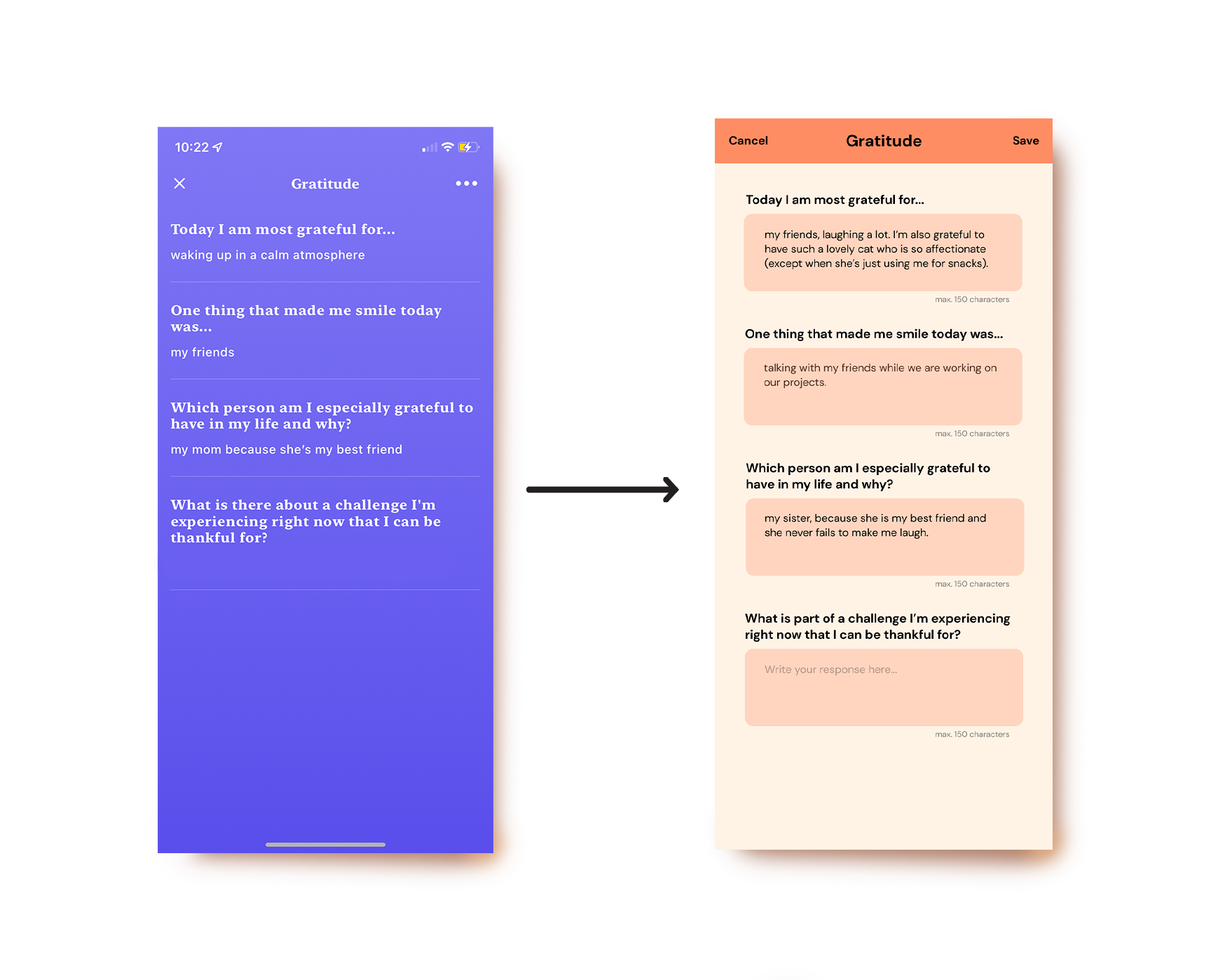
GRATITUDE LOG
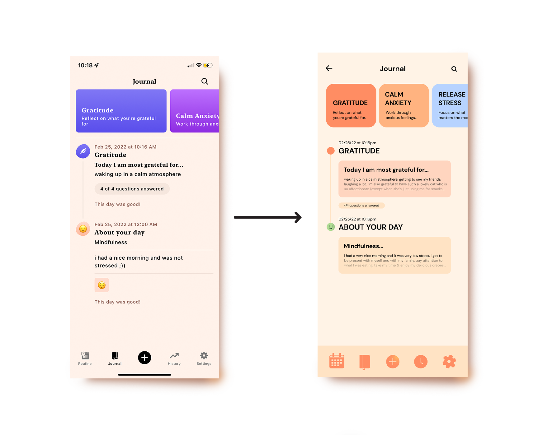
JOURNAL HOME PAGE
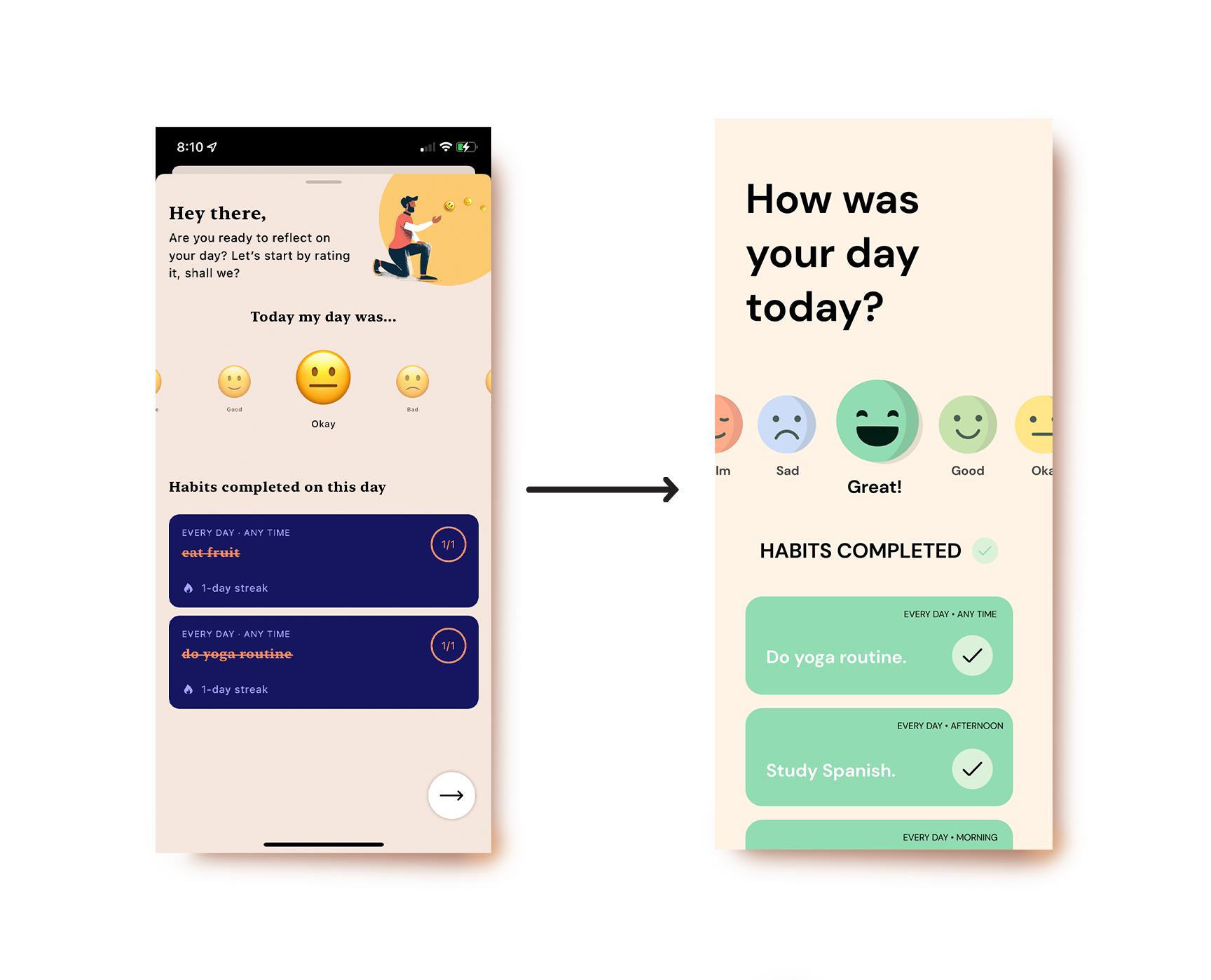
END OF DAY CHECK-IN
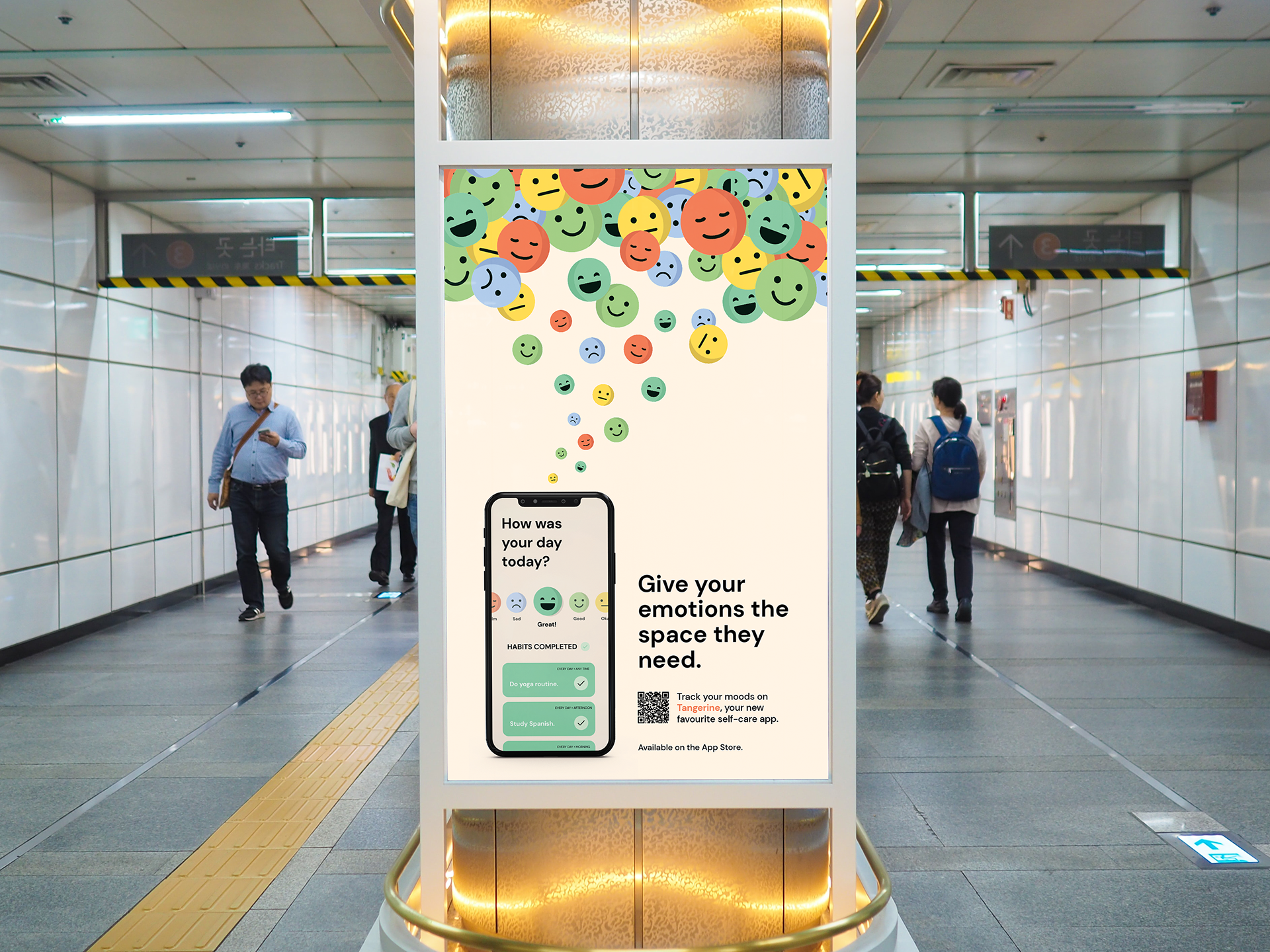
Digital & Print Ads
For the advertisements, I chose to highlight the app's main features, which are the mood and habit trackers. I wanted the ads to reflect the app's friendliness and openness, using prompts from the actual app that would appeal to general viewers.
For the subway ad, I wanted to bring viewers directly into the app. I created a path using the custom emojis that would guide the viewer's eye into the phone screen to show how Tangerine is a dedicated space to track your moods and habits.


Programs Used: Figma, Adobe Illustrator