About
Inspired by the queen of the underworld in Greek mythology, Persephone's is an opulent fine-dining restaurant specializing in North American cuisine. Keywords to describe this brand include classic, organic, and rich.
Project Goal
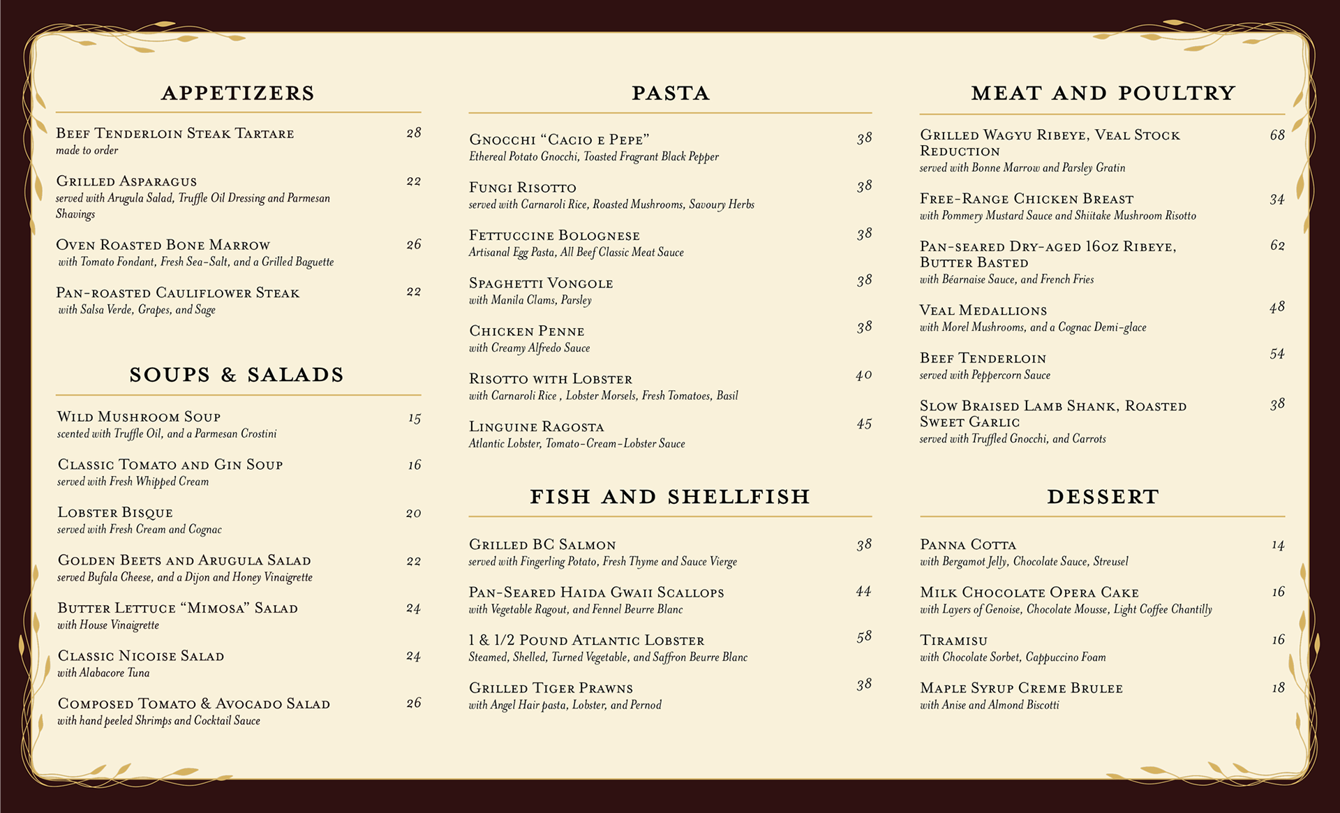
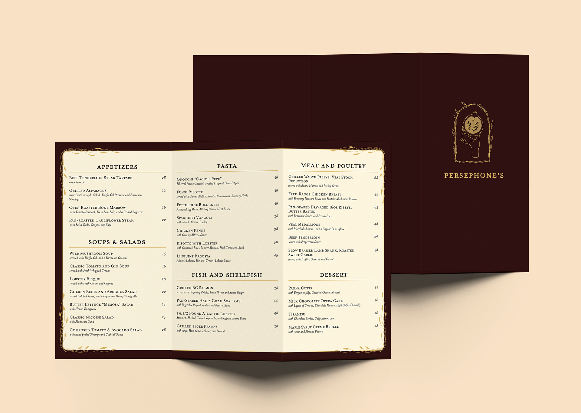
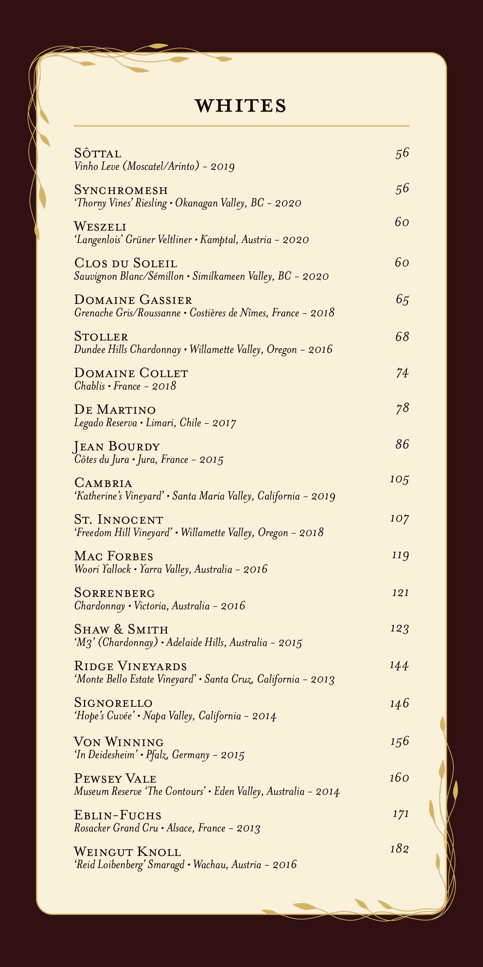
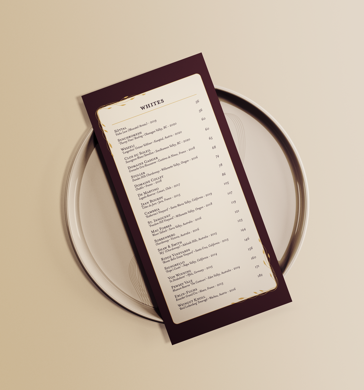
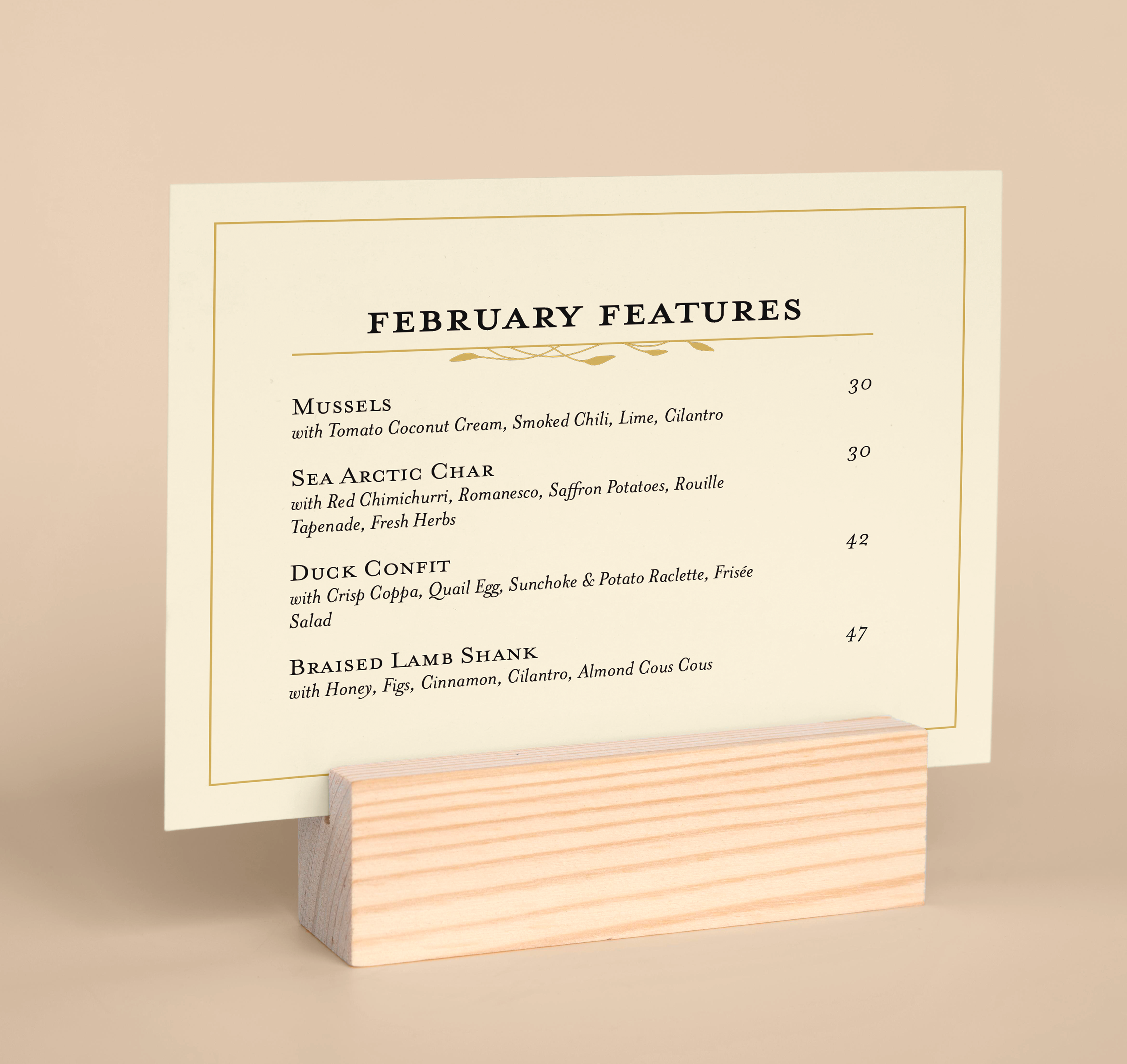
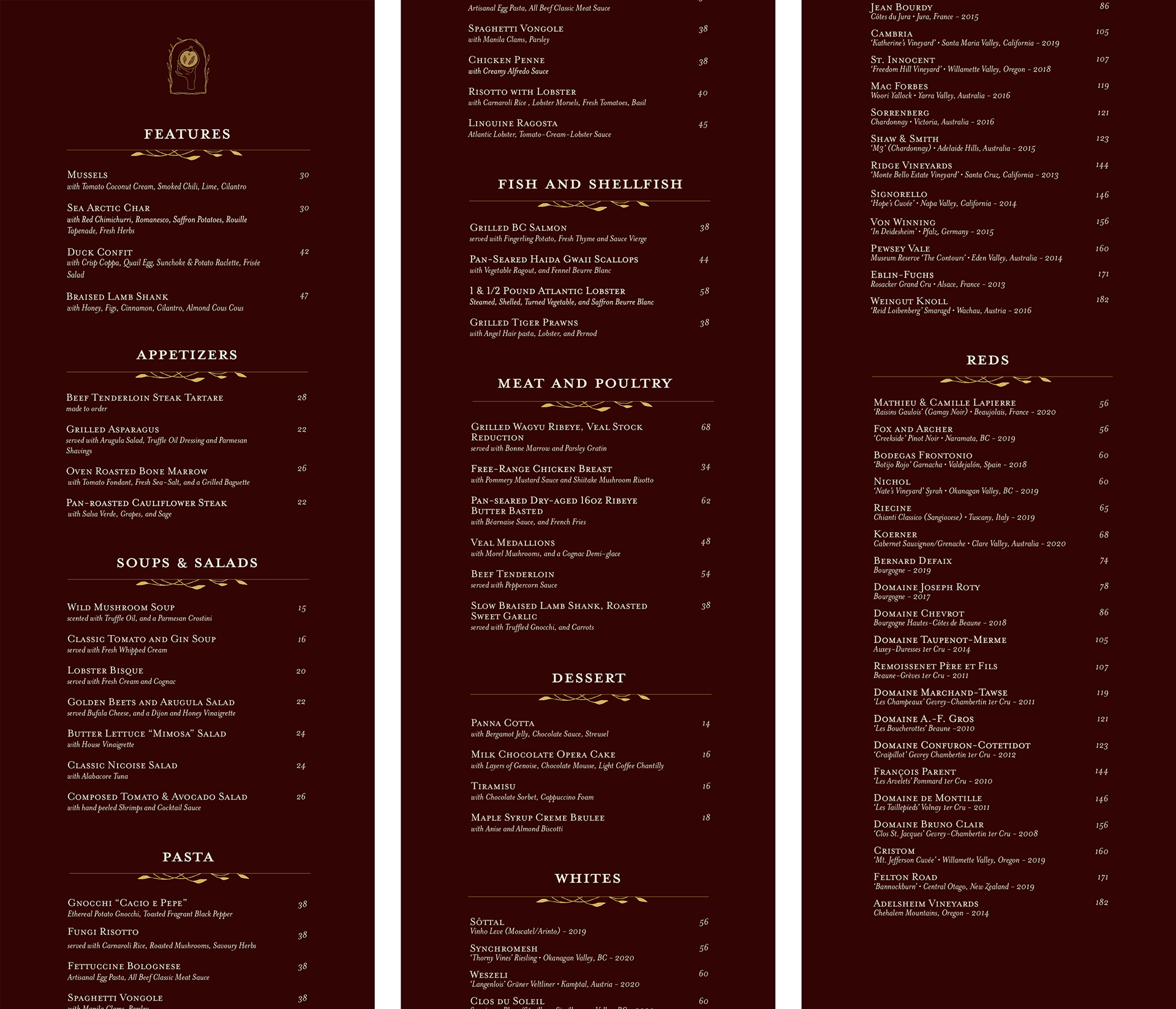
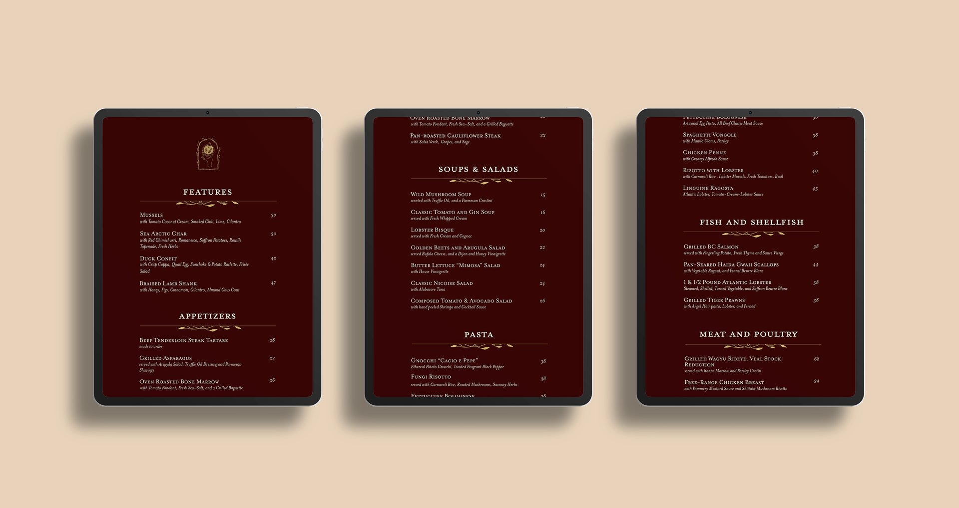
The goal of this project was to create a digital and print menu to appeal to high-end clientele. Both menus were required to be compatible in low-lighting conditions as the restaurant is primarily open during the evening.
Design Solution
I designed a brand identity (logo, colour palette, and embellishments) and used organic, minimalist imagery to create an air of luxury and prosperity. I created an inverse colour palette for each version of the menu in order that they may both be viewed in a dimly-lit space.
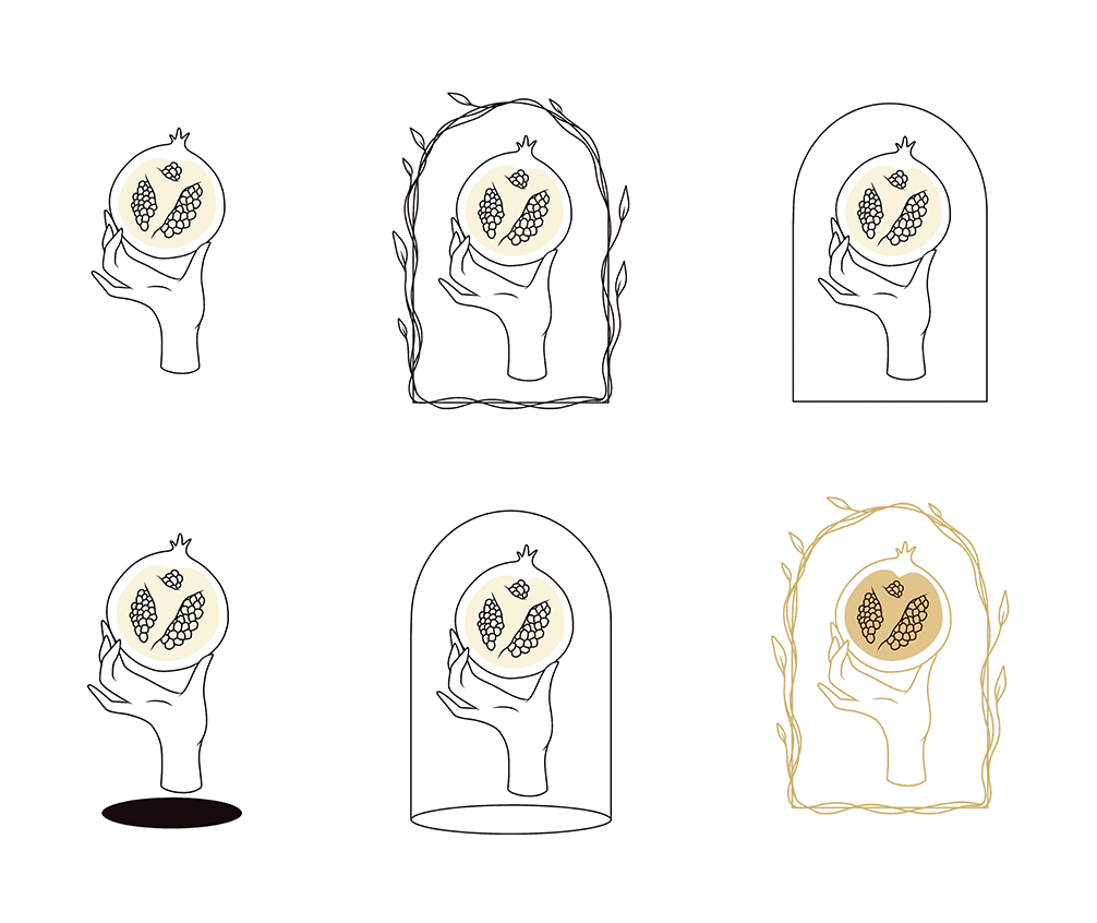
LOGO DRAFTS
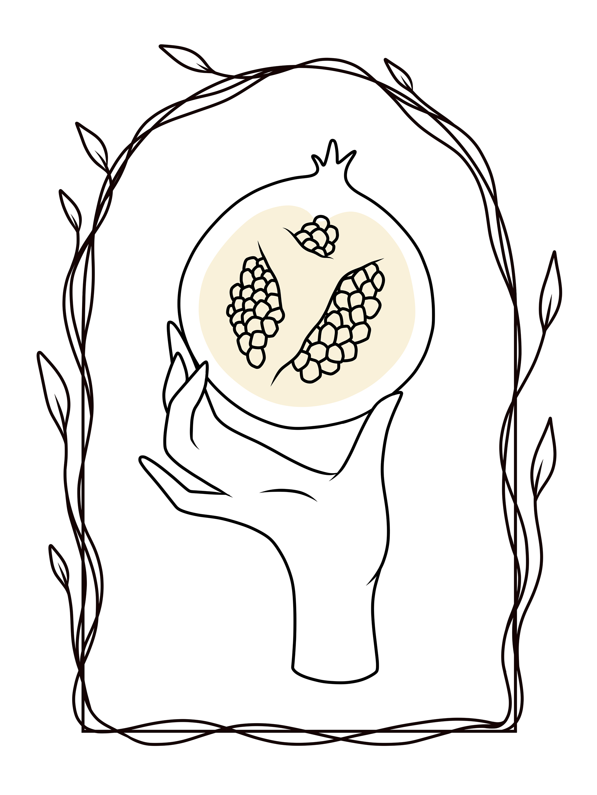
Logo
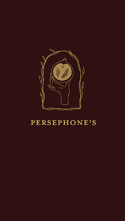
I chose the image of the pomegranate because it is an iconic symbol of Persephone's longing to return to the underworld each season (just as guests would hopefully long to return to the restaurant). I added the leaf detailing as a nod to the Greek laurel wreath, which is symbolic of triumph and success.
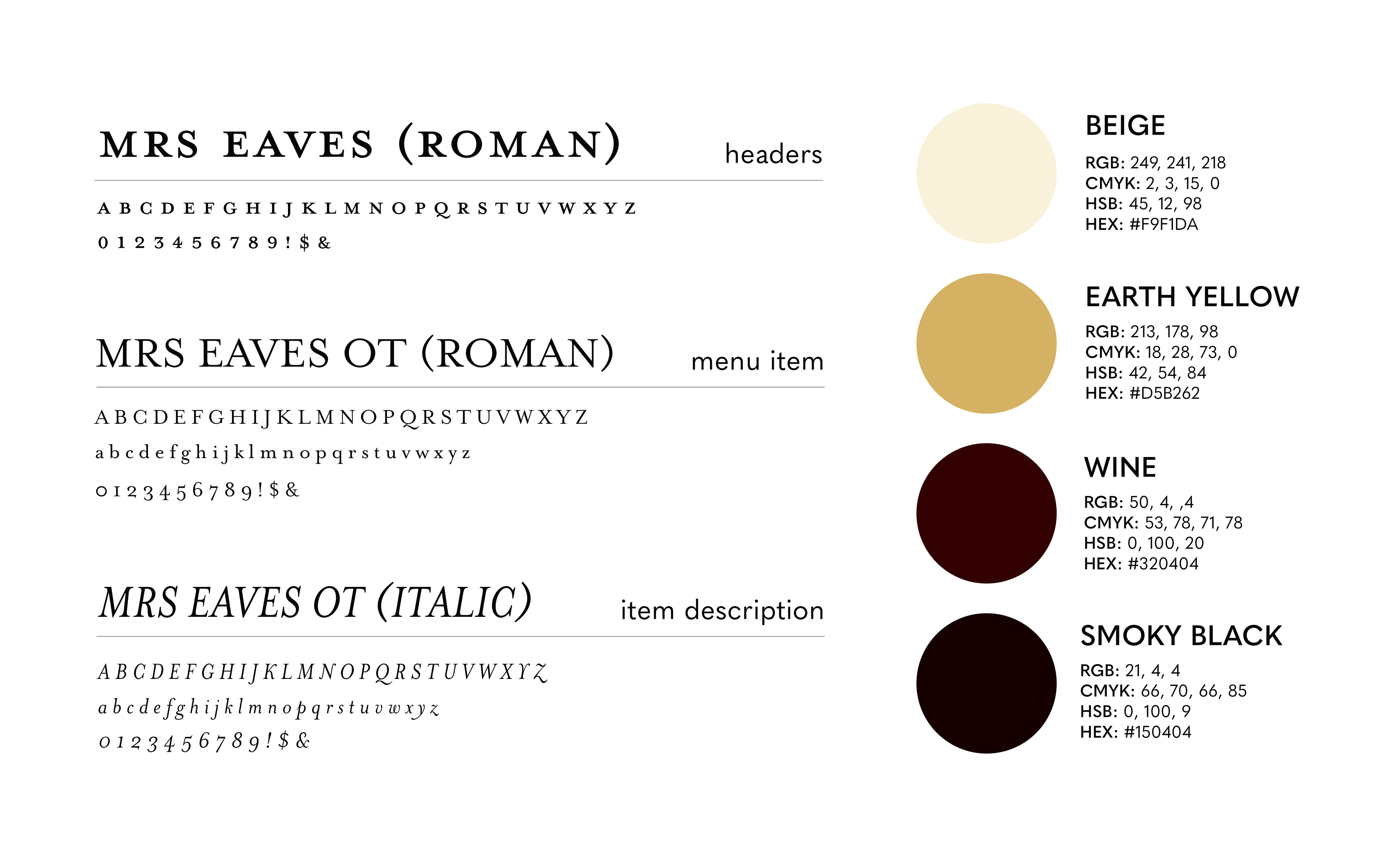
Colours
As the restaurant name refers to the goddess of the underworld, I chose colours to relay more dark and opulent themes. I used a dark wine colour to represent the juice from pomegranate seeds, with gold embellishments providing elegance and contrast. I then chose the beige colour for the print menu to reflect a warm, calming atmosphere.
Typography
I chose the serif typeface "Mrs Eaves" to give the menu a classy, traditional look, which reflects the tone of the restaurant. The font variations made this typeface versatile between the different hierarchies of text, and the low x-heights allowed for efficient use of space.
Print Menu
Wine List & Features Menu


Digital Ipad Menu
Programs Used: Adobe InDesign, Adobe Fresco, Adobe Photoshop