About
Clementine is a magazine for all things related to books and literary topics. Its main goal is to foster conversation in the literary sphere and to create an inviting community for readers and writers alike.
Project Goal
The goal of this project was to showcase the same content using different constraints and device configurations.
Design Solution
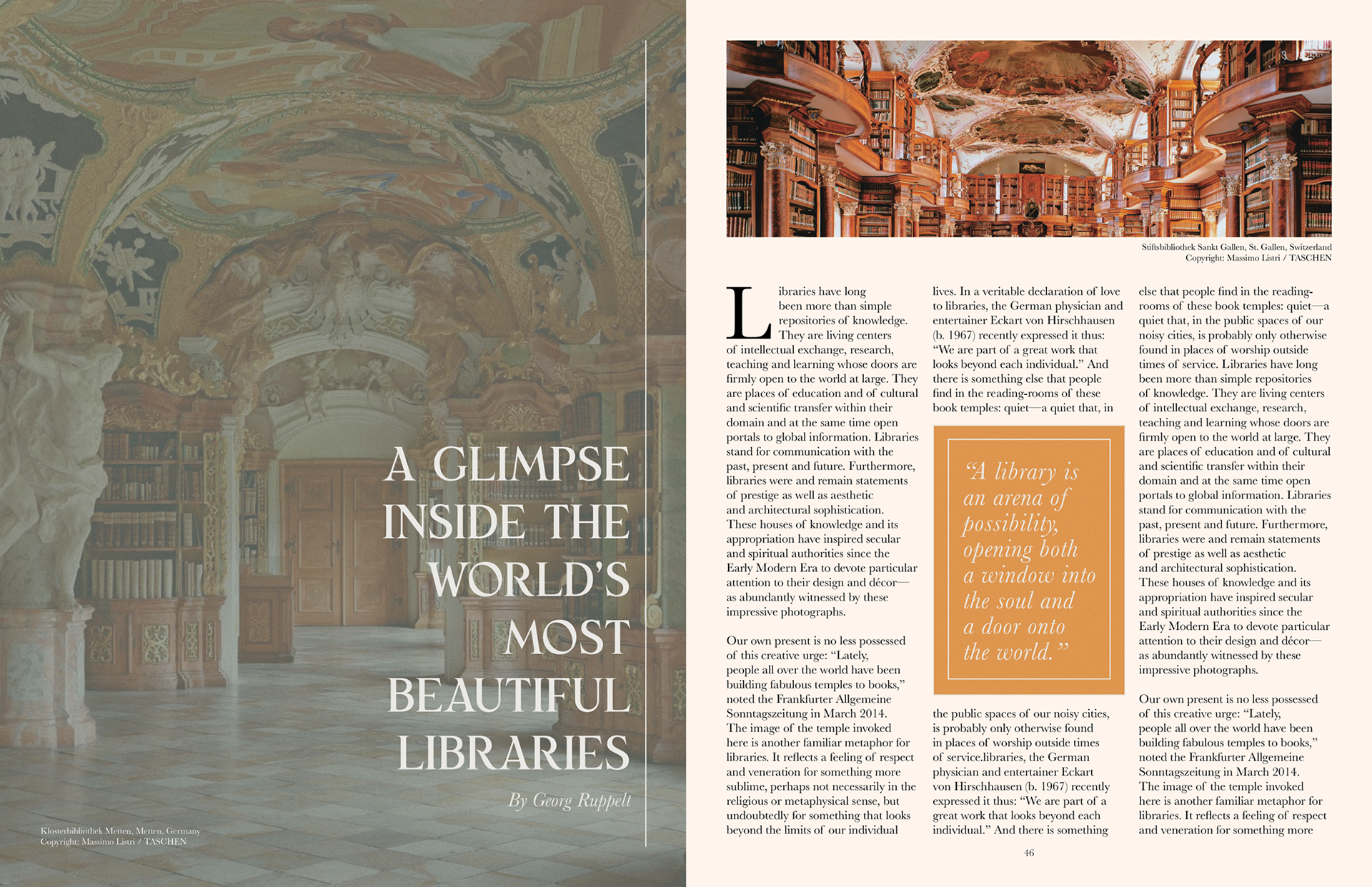
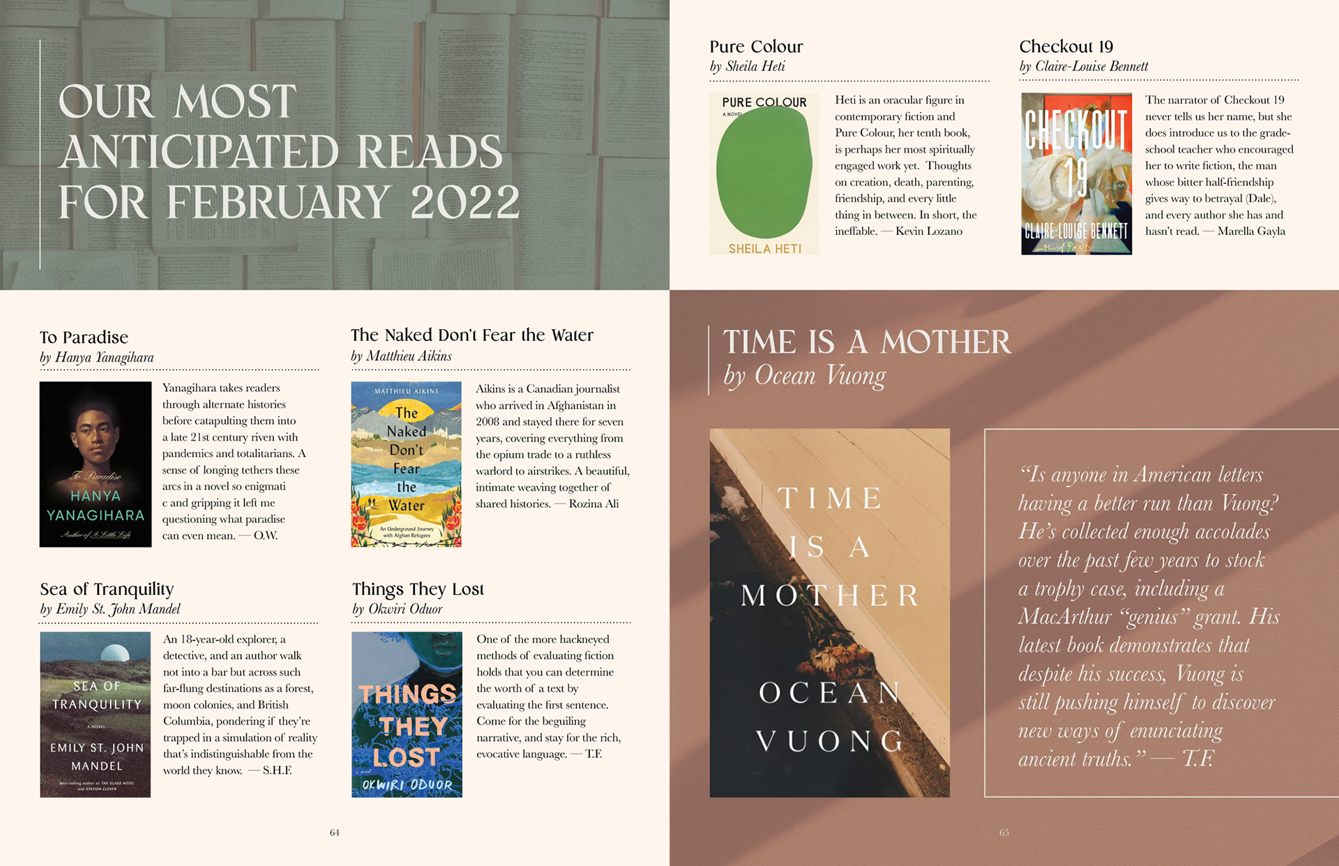
I created a magazine layout which could be adapted to suit different devices and limitations using a three- and four-column grid system.
Cover Concept
For the cover, I chose to combine an image of a Grecian-style sculpture with clementines in order to illustrate Clementine's appreciation for both the classic and the contemporary, the old and timeless vs. the new and fresh.
Colours
For the colour palette, I selected a bright orange from the clementine image as well as a stone-grey colour from the Grecian sculpture. I added a smoky green to complement the dark greens in the leaves while also providing enough contrast between the background and the colours in the stone. I then added a taupe colour in order to accent the green and to integrate it with orange tints.
Typography
For headers and article titles, I chose the typeface "Monik" for its elegant serifs and classic overall look. For body text, "Baskerville" was selected for its similarities to Monik in both x-height and hairline weight.


Pages & Spreads
Programs Used: Adobe Photoshop, Adobe InDesign
